
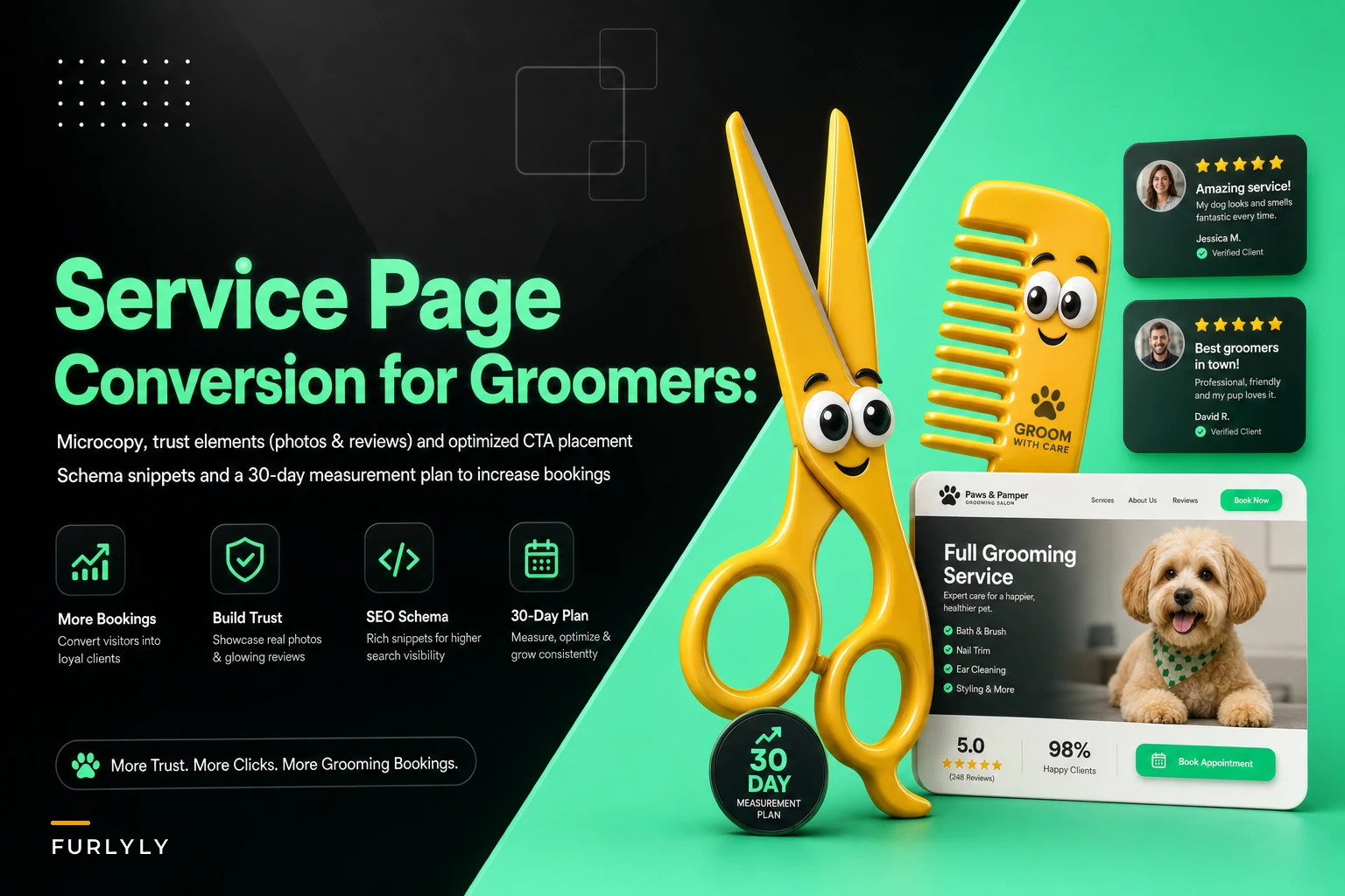

Most groomer service pages read like a menu taped to a wall. A list of packages, a phone number, maybe a stock photo of a poodle that isn't even one of your dogs. And then owners wonder why traffic bounces without a single booking.
Why Most Grooming Service Pages Leak Bookings Before Anyone Sees the Price
Most groomer service pages read like a menu taped to a wall. A list of packages, a phone number, maybe a stock photo of a poodle that isn't even one of your dogs. And then owners wonder why traffic bounces without a single booking.
The page isn't losing bookings because your prices are wrong or your grooming is bad. It's losing them in the first fifteen seconds — before pricing, before packages, before anyone reads a word about your team. Someone lands, feels a flicker of "will these people be careful with my dog," doesn't find an answer fast enough, and closes the tab.
Improving groomer service page conversion is mostly about answering the anxious questions in a pet owner's head in the order they ask them, then removing every excuse not to book right now.
The Three Questions a Visitor Is Silently Asking
Before you touch microcopy or CTAs, understand what's actually running through someone's head when they land on a grooming service page. In roughly this order:
Never miss a grooming appointment again.
Furlyly helps you book, confirm, and manage every pet grooming appointment effortlessly.
- Unified appointment scheduling
- Automated client reminders
- Staff availability & shift management
No credit card required
-
"Are these people going to be gentle and safe with my dog?"
-
"Do they handle dogs like mine?" (double-coated, senior, anxious, giant breed, matted)
-
"How hard is it to actually book, and what will it cost?"
The mistake almost everyone makes: they design the page to answer question 3 first. Prices and package tables get top billing, and the trust question — the one that actually decides whether someone books — gets buried under a fold or shoved into an "About Us" page nobody clicks.
Flip it. Answer safety and fit before price. The page structure that converts looks more like: reassurance → proof → what you do for dogs like theirs → simple price framing → book. Not price → packages → contact.
Microcopy That Reduces Booking Anxiety
Microcopy is the small text around buttons, form fields, and headers. Owners skip it because it "doesn't matter." It matters quite a bit, because it's where you either soothe or spike anxiety.
-
Button says "Submit"
-
Header says "Request an Appointment"
-
Form field label says "Notes"
Compare that with microcopy written for a nervous pet owner:
| Weak microcopy | Converting microcopy | Why it works |
|---|---|---|
| "Submit" | "Check available times" | Sets expectation — no scary commitment yet |
| "Request an Appointment" | "Book your dog's grooming" | Owns the outcome, mentions the dog |
| "Notes" | "Anything we should know? (allergies, anxiety, matting)" | Signals you handle special cases |
| "Contact us" | "Not sure which package? Text us a photo" | Removes decision paralysis |
| "Prices" | "What most owners pay" | Reframes price as normal, not a gate |
None of this is clever copywriting. It's just naming the thing the owner is worried about. When your intake field literally lists "anxiety" and "matting," you've already told an anxious owner — before they've booked — that you've seen dogs like theirs. That single line does more than a paragraph of marketing copy.
"Booked the wrong service? No problem — we'll sort it at drop-off."
One small thing that punches above its weight: put a line of microcopy directly under the booking button that removes the fear of getting it wrong. Something like "Booked the wrong service? No problem — we'll sort it at drop-off." People hesitate on that button because they're scared of picking the wrong thing. Just tell them it's fine.
Trust Elements: What Actually Moves People vs. What's Just Decoration
This is where groomers waste the most page space. Badges, a wall of five-star ratings with no text, a founder's mission statement. Most of it is decoration. Here's what actually moves a booking.
Real photos of your actual work — before and after. Not stock. Not the fluffy show-groom Instagram shots. The messy-matted-Shih-Tzu-becomes-clean-Shih-Tzu shots. These do two jobs at once: they prove skill and they show you handle hard cases. Owners with a difficult dog are your highest-value, most-loyal clients, and they're scanning for evidence you won't turn them away.
Photos of your groomers, faces visible, holding dogs. A person holding a calm dog is worth more than any certification logo. It answers the safety question instantly. If a groomer has a certification, put it as a caption under their photo, not floating alone in a badge strip.
Reviews that mention specific fears, not just praise. A review that says "great service, highly recommend" converts almost nothing. A review that says "My golden gets terrified at the vet but he actually walked in happy — they went slow with him the first time" converts the exact anxious owner reading it. When you ask clients for reviews, ask them to mention what they were worried about beforehand. Those specific-fear reviews are gold.
Place three of those reviews right next to your booking CTA, not in a separate testimonials carousel three screens down. The proof needs to be where the decision happens.
-
- [ ] At least 4–6 real before/after photos of your own work
-
- [ ] Groomer headshots with names and one human detail each
-
- [ ] 3 reviews that name a specific fear or hard case
-
- [ ] A visible line about safety handling for anxious or senior dogs
-
- [ ] Photo consent handled properly before anything goes public
-
- [ ] No stock photos of dogs you've never groomed
That last point on consent isn't a formality — using client dog photos without clear permission is a real liability, and it's worth having a clean process for it before you build a photo-heavy page.
CTA Placement: Where the Book Button Actually Belongs
The single most common failure: one booking button, at the very bottom of the page. People decide to book at different scroll depths. Some are ready after the first reassuring line. Some need to see the before/afters. Some need the reviews. If your only CTA is at the bottom, everyone who decided early has to scroll past everything to act — and a chunk of them won't bother.
-
Above the fold — primary button right after the reassurance headline. Not "learn more," an actual booking CTA.
-
After the before/after photos — "See a dog like yours? Book your slot."
-
Right beside the reviews — proof and action in the same eyeline.
-
After the price framing — once they know roughly what they'll pay.
-
Sticky mobile bar — a persistent "Book now" bar at the bottom of mobile screens, because most grooming traffic is on a phone.
That's four or five placements of essentially the same action. It feels like a lot when you build it. It isn't. Nobody notices repeated CTAs unless they're intrusive; they only notice the absence of one when they're ready to act.
One nuance worth flagging: a large share of grooming searches happen on mobile, often one-handed, often while the owner is staring at a shedding dog on the couch. The sticky book bar matters more than any desktop layout decision. If you optimize one thing, make it the mobile booking path.
A Word on the Booking Flow Behind the Button
The button is only half of it. What happens after the click decides whether the intent survives.
The most common leak: the button opens a generic contact form, or worse, forces a phone call during business hours when the owner is browsing at 9pm. The intent to book is highest in that moment. If the next step is "call us tomorrow," you've handed that booking to whoever has real-time online scheduling.
The workflow that keeps intent alive looks like this:
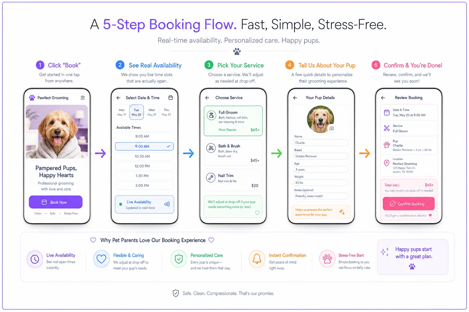
Visitor clicks "Book" → Sees real available time slots → Picks service (with "we'll adjust at drop-off" reassurance) → Enters dog details → Confirms booking
No account creation, no ten-field form, no waiting for a callback. Every extra step between the click and the confirmed slot loses people. Connecting your booking button to live scheduling quietly does the heavy lifting here — not as a flashy feature, but because it removes the gap where intent goes to die. If someone can lock a real slot in under a minute at 9pm, they will. If they have to wait for a callback, roughly a third of them book somewhere else in the meantime.
This is exactly where AI-powered scheduling tools earn their keep — handling the intake, surfacing the right time slots, and confirming the appointment without anyone at the salon having to pick up the phone after hours.
Schema Snippets: Help the Page Show Up Right in Search
Structured data won't fix a weak page, but on a good one it earns you review stars, prices, and business info directly in search results — which lifts click-through before anyone even lands. For a grooming service page, two schema types carry most of the weight.
{ "@context": "https://schema.org", "@type": "PetGroomer", "name": "Your Salon Name", "image": "https://yoursite.com/photos/salon.jpg", "telephone": "+1-555-000-0000", "priceRange": "$$", "address": { "@type": "PostalAddress", "streetAddress": "123 Example St", "addressLocality": "Yourtown", "addressRegion": "ST", "postalCode": "00000" }, "openingHours": "Tu-Sa 09:00-17:00", "makesOffer": { "@type": "Offer", "itemOffered": { "@type": "Service", "name": "Full Groom - Small Dog" } } }
{ "@type": "PetGroomer", "name": "Your Salon Name", "aggregateRating": { "@type": "AggregateRating", "ratingValue": "4.8", "reviewCount": "127" } }
Two warnings. Only mark up reviews that genuinely exist on the page or on verifiable sources — fabricated rating markup gets penalized. And keep the schema in sync with what's actually on the page; if your schema says you're open Saturdays but the page says closed, search engines lose trust in both.
A Real Scenario: What Changing the Order Did
A two-groomer salon doing roughly 300–330 grooms a month had a service page that led with a package price table. Nice photos, decent reviews — but the reviews were buried in a carousel near the footer and the only booking button sat under it.
The changes were unglamorous: moved a reassurance headline and a book button above the fold, put three "my dog is anxious" reviews next to a mid-page CTA, swapped stock photos for their own before/afters, added a sticky mobile book bar, and connected the button to live scheduling instead of a callback form.
Nothing about pricing or packages changed. Over the following two months, the share of page visitors who started a booking rose from around 4% to just over 6%. On their traffic volume, that worked out to roughly 20–30 extra booking starts per month, most of which converted. No new marketing spend — just answering the anxious questions in the right order and cutting out the callback delay.
When This Is Worth Doing — and When It Isn't
When it makes sense: you're already getting traffic to the page but bookings feel low relative to visits, you rely on phone tag, or your booking button leads somewhere clunky. These are the highest-return fixes because the demand already exists.
When it's a bad idea to obsess over this: if barely anyone is landing on the page at all, conversion tweaks are polishing a car with no engine. Fix the traffic problem first. Optimizing microcopy for 40 monthly visitors is not where your time goes.
Who should skip most of this: fully-booked salons with a months-long waitlist. If you can't take new clients anyway, a high-converting page just creates disappointment and admin work. Your page's job then is to filter, not convert — set expectations, mention the waitlist, capture emails.
A 30-Day Test Plan to Measure the Lift
You don't need to guess whether any of this worked. Run it as a simple month-long test and watch one number.
Week 1 — Baseline. Before changing anything, record your current numbers: page visits, booking-flow starts, and completed bookings. Get a clean ratio of visits-to-completed-bookings. This is your control.
Week 2 — Ship the trust and microcopy changes. Real photos, groomer headshots, the three fear-specific reviews near a mid-page CTA, and the reworked button and field microcopy. Don't touch pricing. Keep everything else identical so you know what caused any movement.
Week 3 — Ship the CTA placement and booking-flow changes. Add the above-the-fold button, the sticky mobile bar, and connect to live scheduling if it isn't already. Now you're testing whether removing the callback delay actually moves the needle.
Week 4 — Measure and hold. Compare completed-booking rate against your Week 1 baseline. Look specifically at mobile, since that's where the sticky bar and live scheduling should show the biggest jump.
-
Watch completed bookings, not just clicks. A CTA that gets more clicks but the same bookings just moved the leak downstream.
-
Account for seasonality — comparing a slow week to a busy one will give you a misleading read. If you can, compare to the same period last year rather than the week before.
-
Pay attention to why people book, if your form captures it. More "my dog is anxious" notes is a good sign the trust changes are pulling in exactly the clients you want.
If you want to go deeper on turning those extra bookings into higher-value visits and repeat clients, it's worth pairing this with the thinking in Stop Leaving Money on the Table: experiment templates to lift your grooming average ticket and the retention framing in How Ignoring Lifecycle Stages Costs Groomers Repeat Business. A page that converts a first booking is step one; keeping that client is where the real money is.
The Part Most Owners Underweight
The service page isn't a brochure. It's the moment a nervous person decides whether to hand you their dog. Every headline, photo, review, button, and form field is either lowering or raising that anxiety. Most pages accidentally raise it — leading with price, hiding proof, forcing a callback — and then blame the market for slow bookings.
Get the order right, put the proof where the decision happens, make the button lead to a real slot instead of a promise to call back, and measure the lift honestly over a month. None of it is expensive. It's mostly rearranging what you already have so it answers the right question at the right moment.
Get the order right, put the proof where the decision happens, make the button lead to a real slot instead of a promise to call back, and measure the lift honestly over a month. None of it is expensive. It's mostly rearranging what you already have so it answers the right question at the right moment.
Ready to streamline your grooming business?
Join 500+ pet groomers using Furlyly to save time, reduce scheduling conflicts, and deliver exceptional client experiences.